
to re-imagine the matcha label design for anticipated launch of new products in a series or collection setting.
to create a label design that will appeal to the company's target consumer and improve shelf aesthetic to ultimately increase sales and brand outreach.
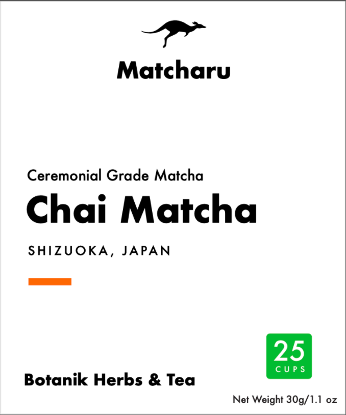
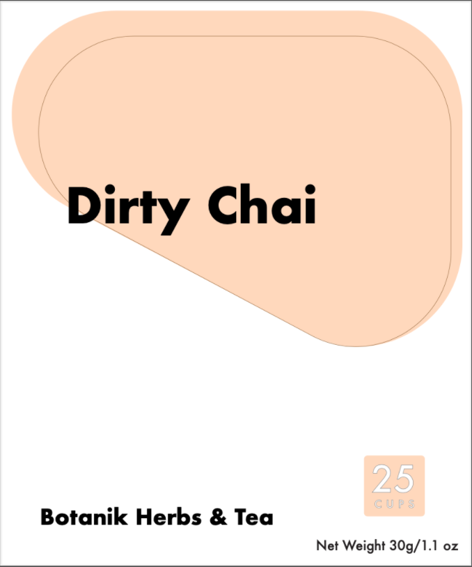
previous label design in production
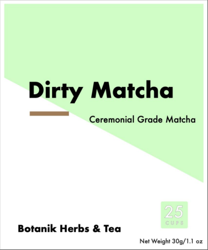

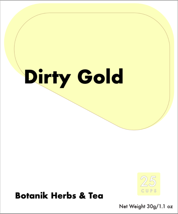
design one
to incorporate color that is consistent with the brand identity in a bold presentation with sharp geometry communicating visual hierarchy.
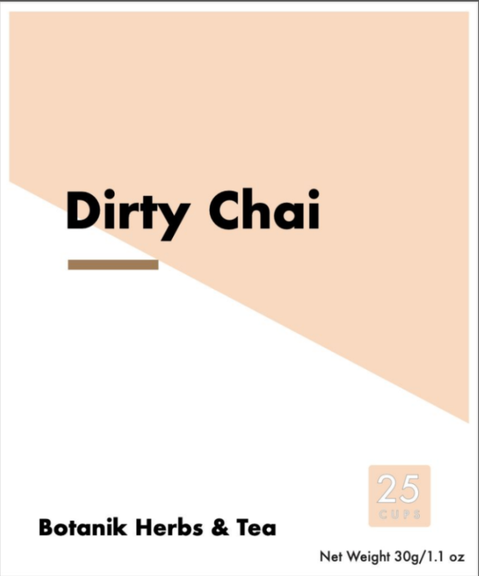
design two
to incorporate color that is consistent with the brand identity in an inviting presentation with soft geometry communicating visual hierarchy.

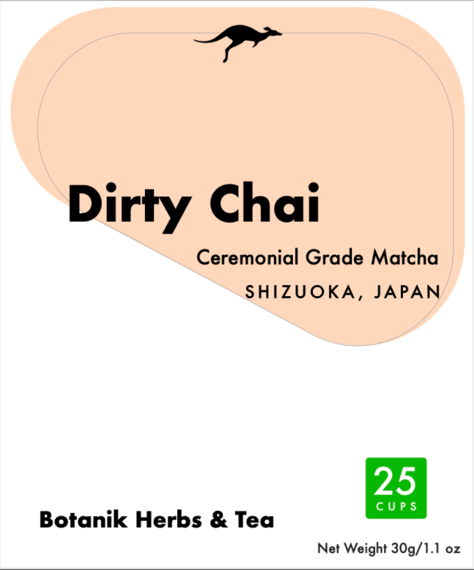

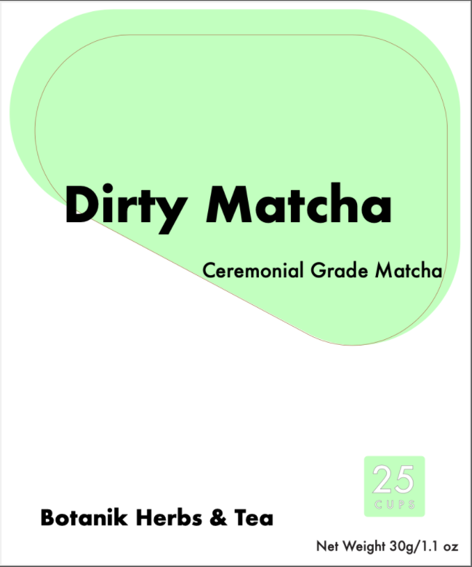
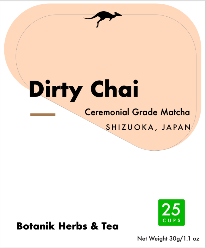
revision one
to incorporate details in a way that will effectively communicate the brand and product information hierarchy, to the inviting design with soft geometry.
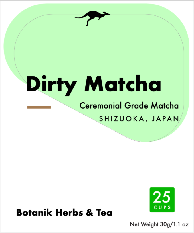
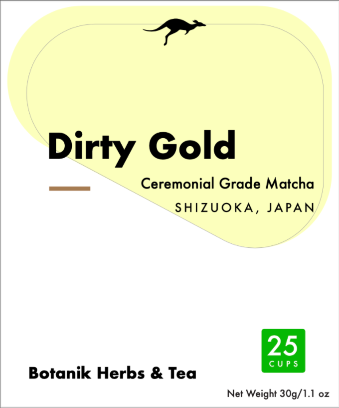
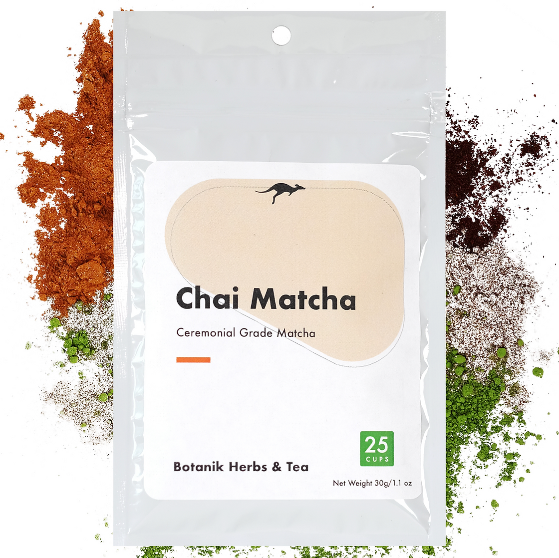
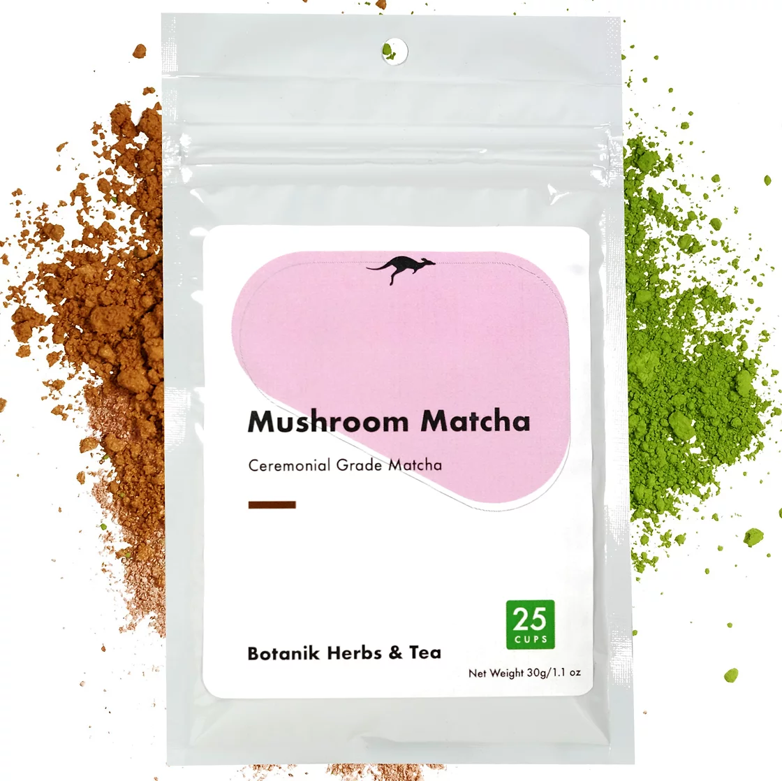
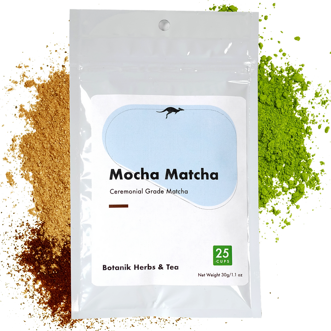
final
to appeal to the collection culture and brand identity by continuing the unifying underscore in the negative space and to balance the overall visual aesthetic.
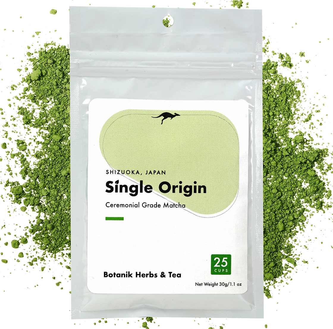
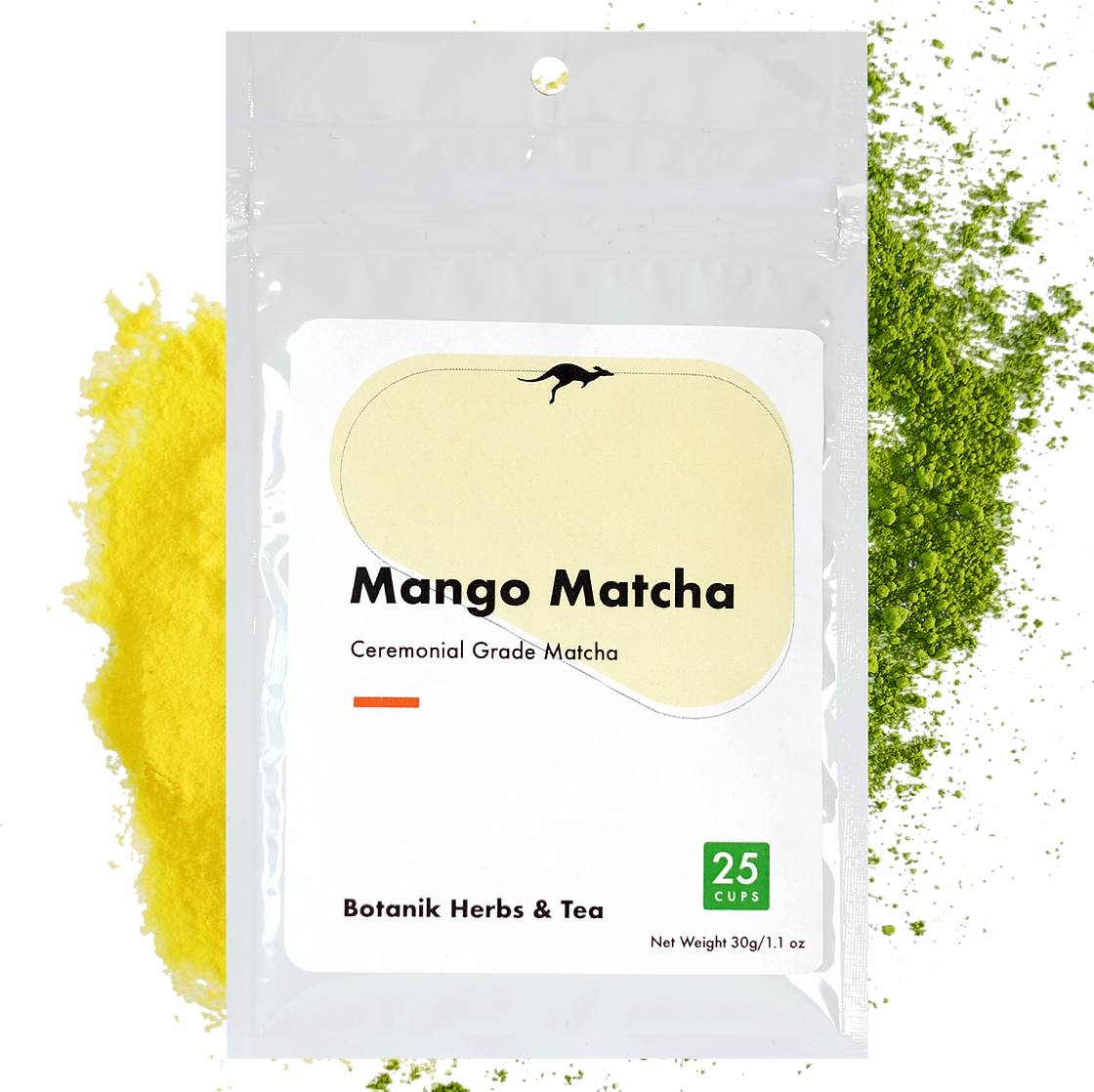
current label design in production

see my contribution to the company buy shopping
on their website
or on their amazon store